Product page
The Product section, its gallery layouts, blocks and the features that use product data such as metafields.
Open a product template in the theme editor (page selector Products > Default product) to edit it. You can create alternate templates, for example one per product type, in Online Store > Themes > Customize > Products > Create template.
Gallery
| Setting | Options and description |
|---|---|
| Gallery style | Stacked, Thumbnails below, Thumbnails left, Thumbnails right, Carousel, Grid, Mosaic or Spotlight. |
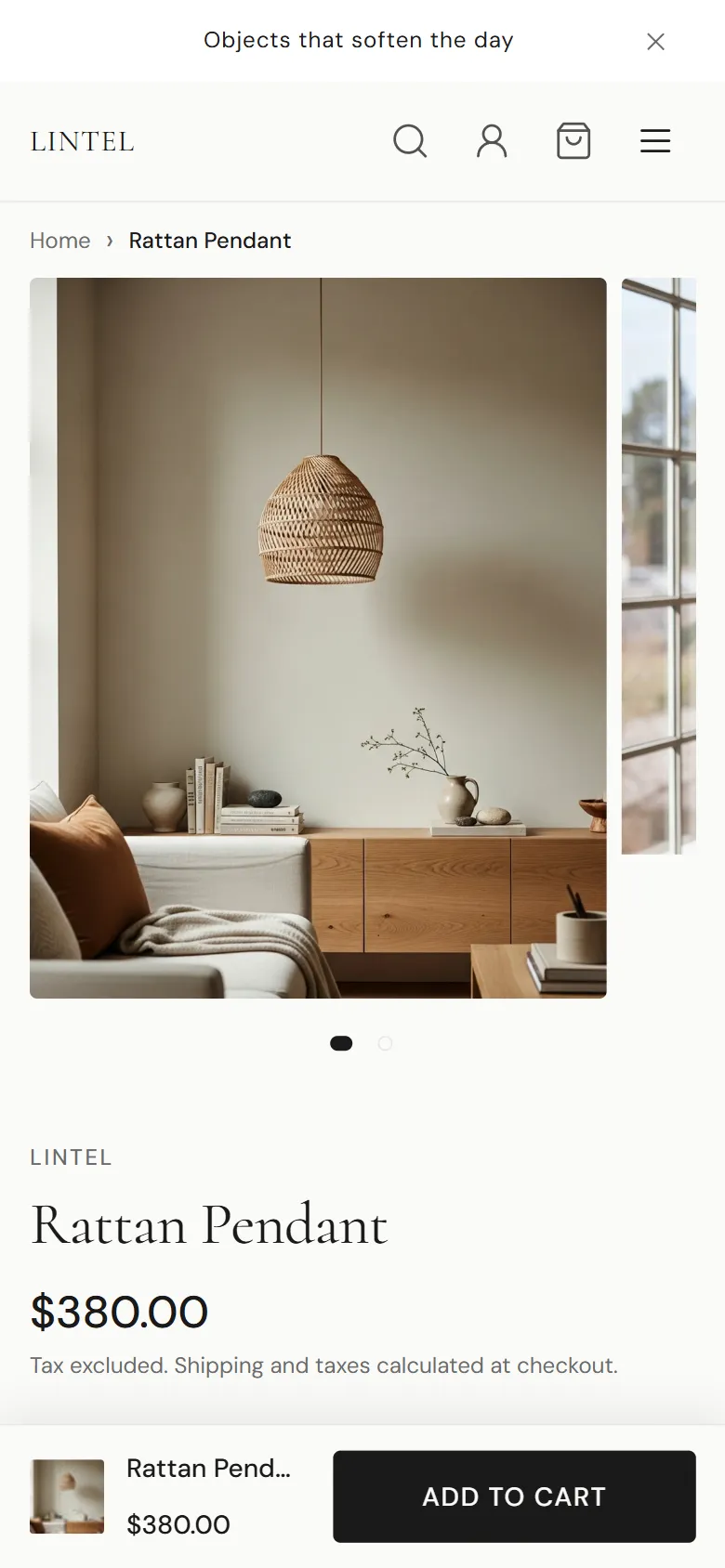
| Mobile gallery style | Carousel, Stacked or Grid. |
| Image aspect ratio | Natural, Square (1:1), Portrait (3:4), Portrait (4:5), Portrait (2:3), Landscape (4:3), Landscape (5:4), Wide (16:9) or Custom. |
| Custom aspect ratio | Used with Custom, for example 3/4. |
| Image fit | Contain shows the whole image. Cover fills the frame and crops. |
| Thumbnail size | Small, Medium or Large. |
| Gap between images, Image corner radius | Spacing and corner style. |
| Zoom | None, Lightbox or Hover magnify. |
| Autoplay carousel, Autoplay speed, Loop carousel | Carousel behavior. |
When a shopper picks a variant that has its own image, the gallery shows that image. Videos and 3D models added to the product play in the gallery.
Layout
| Setting | Description |
|---|---|
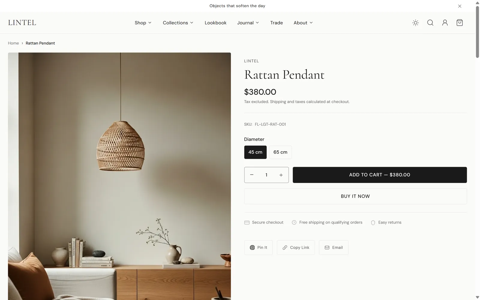
| Page layout | Media left, Media right, Wide gallery, Editorial or Compact. |
| Gallery width | Small (40%), Medium (50%) or Large (60%). |
| Product information alignment | Left or Center. |
| Product information spacing | Compact, Balanced or Airy. |
| Sticky product information on desktop | Keeps the product details in view while the gallery scrolls. |
| Enable sticky add to cart bar | Shows a compact add to cart bar after the main button scrolls out of view. |
| Content display mode | Shows the Product accordion as an Accordion or Tabs. |
| Show complementary products, Show frequently bought together, Show product recommendations | Turn the recommendation areas on or off. |
| Show reviews section | Shows reviews from a reviews app that writes Shopify’s standard review metafields. |
| Show product story section | An image-and-text band below the product: Story image, Eyebrow text, Heading, Text, Button label, Button URL. |
Blocks
Reorder blocks by dragging them in the sidebar.
| Block | What it shows |
|---|---|
| Vendor | The product vendor. |
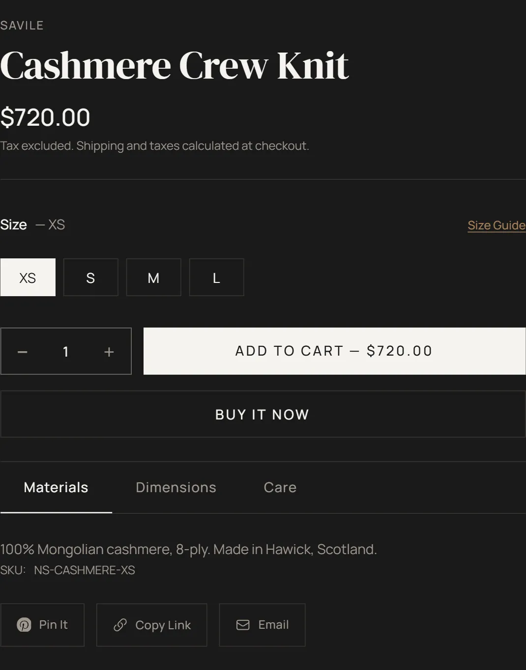
| Title | The product title. Heading size: H1 — Extra large, H2 — Large or H3 — Medium. |
| Price | Price, compare-at price and unit price. |
| Rating | Star rating from a reviews app. |
| Highlights | A short list of product highlights from the product’s product.highlights metafield. |
| Variant picker | Picker type (Button, Swatch or Dropdown) and Show color options as swatches. |
| Quantity selector | Quantity input. |
| Buy buttons | Add to cart button. Show accelerated checkout adds dynamic checkout buttons such as Shop Pay. |
| Pickup availability | Store pickup availability for the selected variant. |
| Shop Pay installments | The Shop Pay Installments message, when it’s available in your store. |
| Subscription options | Purchase options for products sold with subscriptions (selling plans). |
| Trust badges | Three short lines with card, clock and shield icons. |
| Product accordion | Materials, Dimensions, Care instructions and Shipping and returns tabs. |
| Description | Heading, Body (leave blank to use product description), Text alignment. |
| Size guide | A button that opens a size guide dialog. |
| Share | Share links and a copy-link button. |
| SKU | The selected variant’s SKU. |
| Complementary products | Heading and Products to show. |
| Frequently bought together | A bundle of products the shopper can add in one click. |
| Related products | Heading and Products to show. |
| Custom Liquid | Your own Liquid code. |
| App blocks | Blocks from apps you install, such as reviews or wishlists. |
Color swatches
To show color options as swatches:
- In the Variant picker block, turn on Show color options as swatches.
- In your Shopify admin, open the product, edit the Color option in Variants and choose a swatch color or image for each value. Shopify’s category metafield for color makes this quick.
Options named Color or Colour show as swatches. Other options use the Picker type you choose. Product cards in collection grids also show swatches when the section’s Show color swatches setting is on.
Frequently bought together
The Frequently bought together block shows products the shopper can add to the cart together with the current product.
- Curate per product: set the product metafield
custom.fbt_products(type: list of products). - Or use Shopify recommendations: without that metafield, the block uses the complementary products you set up in the Shopify Search & Discovery app.
- Show related products as fallback: when neither is set, the block shows related products instead.
Other settings: Heading, Maximum products, Show bundle discount, Discount percentage, Auto-select companion items, Show options when unchecked.
Show bundle discount only changes the price shown in the block. To actually charge the lower price, create a matching automatic discount in Discounts.
Complementary and related products
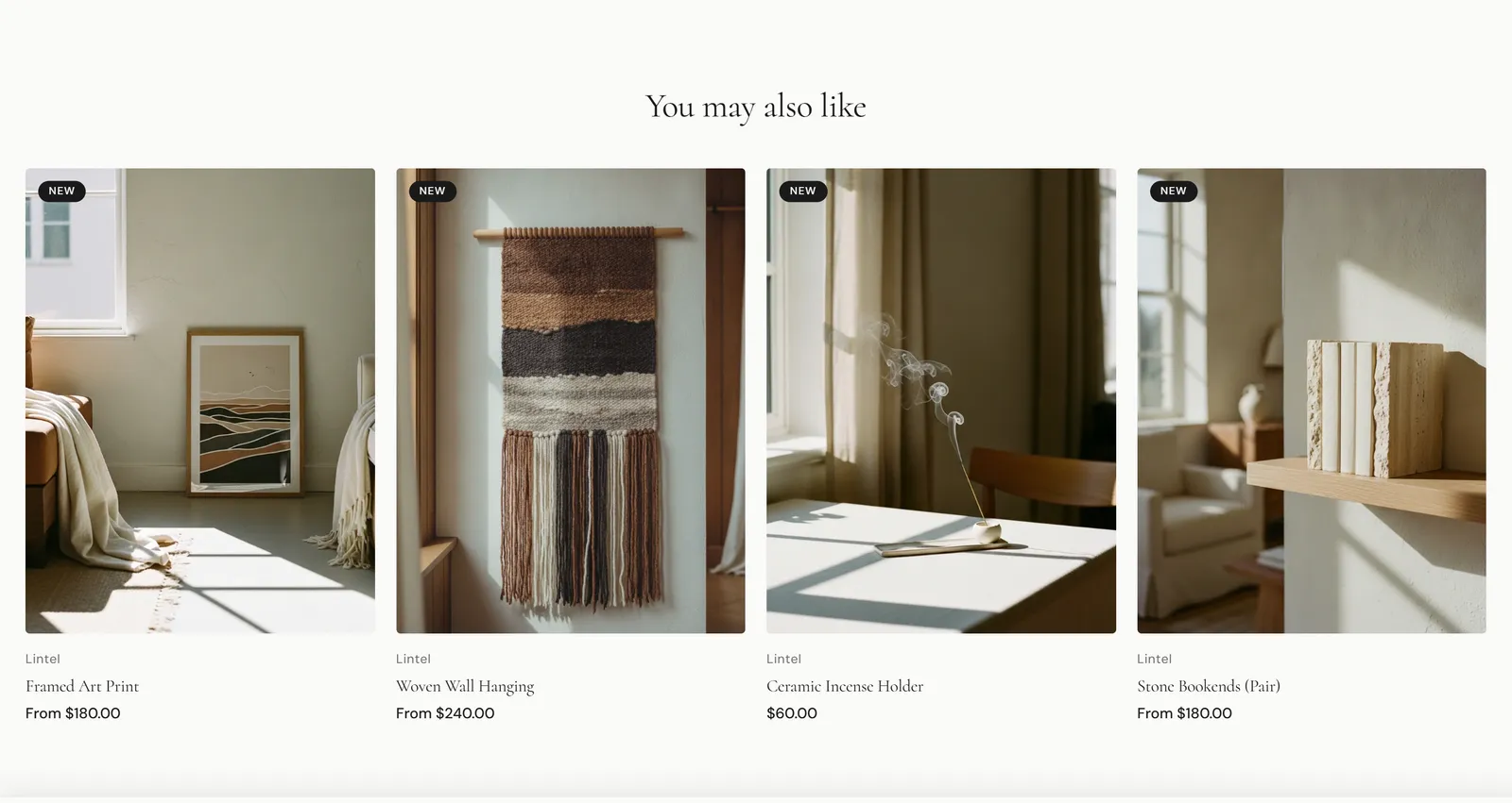
- Complementary products come from the Shopify Search & Discovery app.
- Related products come from Shopify’s automatic product recommendations.
Size guide
The size guide opens in a dialog from the Size guide block. Corbel looks for content in this order and uses the first one it finds:
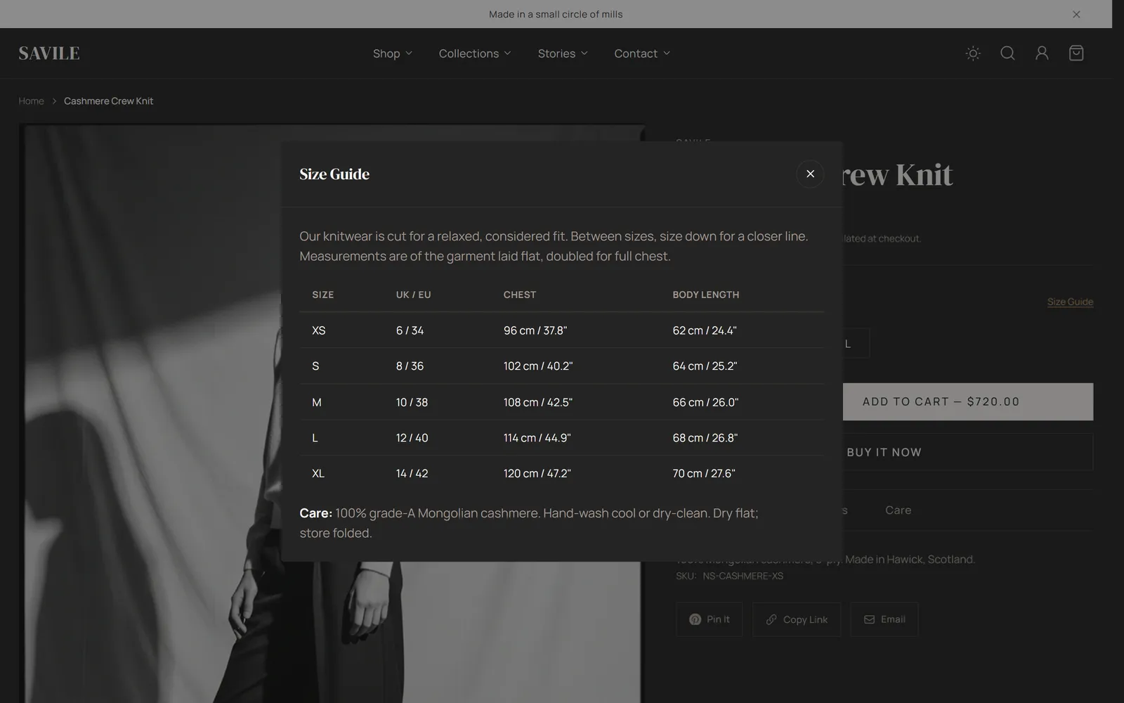
- The product’s
custom.size_guide_pagemetafield (a page reference). Best for tables: edit the page with Shopify’s visual editor. - The product’s
custom.size_guidemetafield (HTML for tables, or rich text for prose). - The block’s Size guide page and Modal content settings.
- The section’s Size guide page and Size guide content settings.
If none is set, the size guide button is hidden.
Product accordion content
Each tab of the Product accordion block (Materials, Dimensions, Care instructions, Shipping and returns) has a default text in the block settings. A product’s own metafield replaces the default:
| Tab | Product metafield |
|---|---|
| Materials | product.materials |
| Dimensions | product.dimensions |
| Care instructions | product.care |
| Shipping and returns | product.shipping |
Leave a tab’s default text blank to hide it on products without the metafield. Other settings: Only one item open at a time, Open first item by default, and a label for each tab.
Subscriptions (selling plans)
Products sold with a subscription app show their purchase options in the Subscription options block: one-time purchase and each subscription plan, with the plan’s price. Corbel shows subscription details in the cart as well. Set up plans with a subscription app such as Shopify Subscriptions.
Pickup availability
When you offer local pickup (Settings > Shipping and delivery > Local pickup), the Pickup availability block shows whether the selected variant can be picked up and opens a list of locations.
Gift cards
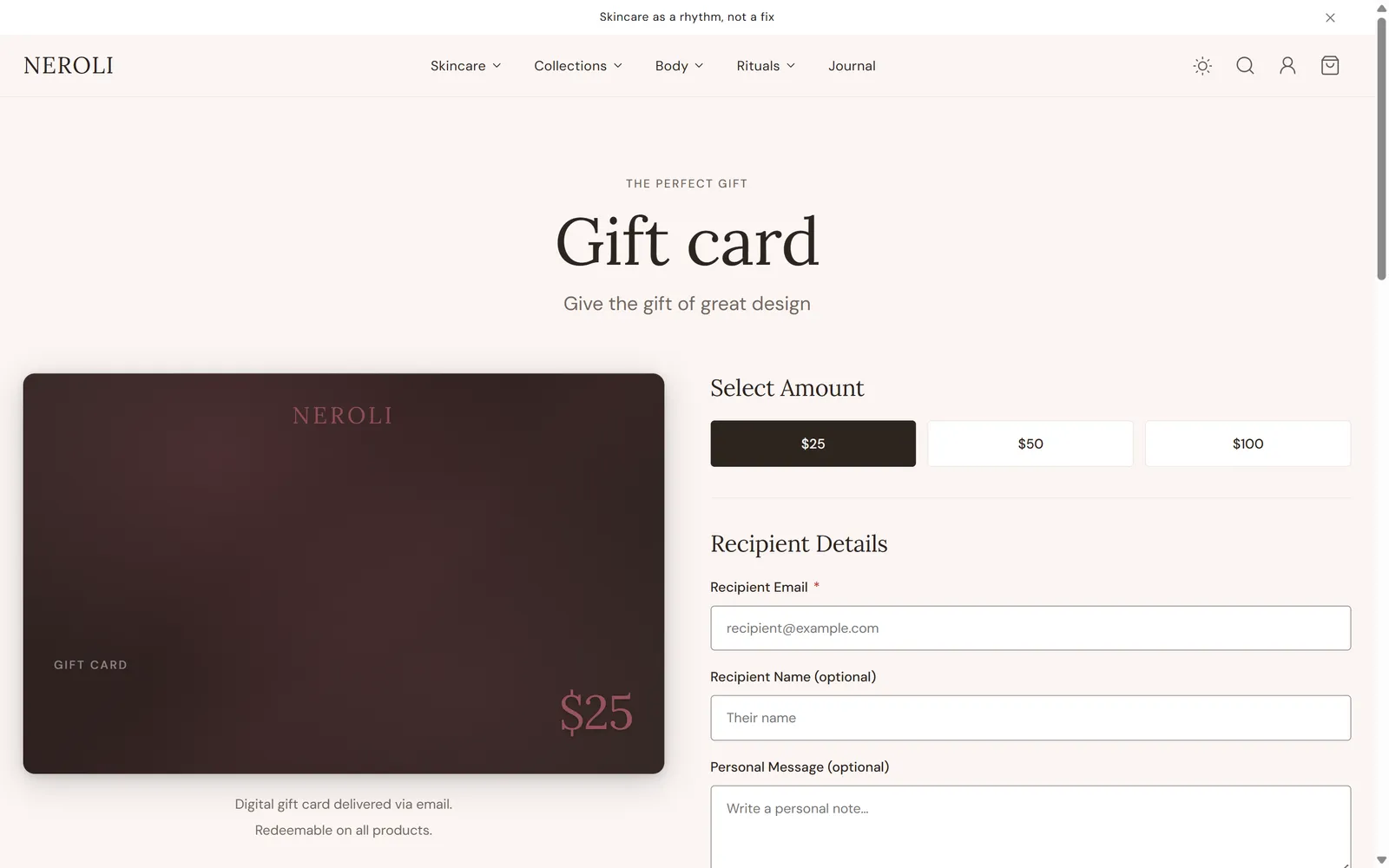
Gift card products use the Gift card section on the product.gift-card template. It includes the recipient form, so shoppers can send the gift card to someone else by email on a chosen date. Assign the gift-card template to your gift card products in the product’s Theme template setting.
Quick view and quick add
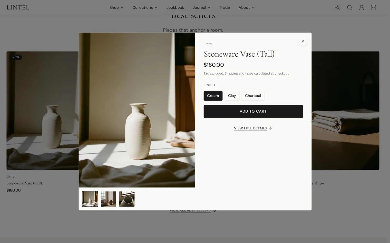
Product cards can show Quick add and Quick view buttons, set per section. Quick view opens the product in a dialog with its gallery, variant picker and add to cart button.