Sections
Sections are the building blocks of your pages. Add them in the theme editor with Add section, then select one to edit its settings and blocks.
Settings most sections share
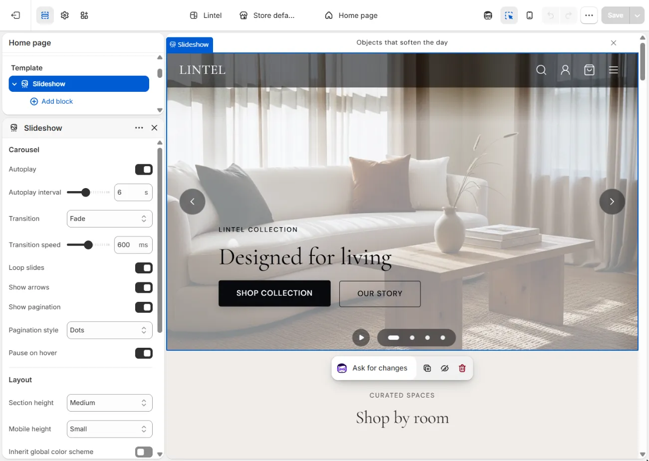
| Setting | Description |
|---|---|
| Inherit global color scheme | On by default. The section uses the Default color scheme from theme settings. Turn it off to choose a scheme for this section. |
| Color scheme | The scheme used when Inherit global color scheme is off. See Color schemes. |
| Top padding / Bottom padding | Space above and below the section. |
| Eyebrow | Short text shown above the heading. |
Most sections also accept app blocks from apps you install, so you can place app content inside them.
Page sections at a glance
| Section | Use it for |
|---|---|
| Slideshow | Full-width hero with image or video slides |
| Image with text | An image beside a heading, text and button |
| Rich text | A heading, text and button with no image |
| Featured collection | A grid of products from one collection |
| Product list | A carousel or grid of products from a collection or a hand-picked list |
| Featured product | One product with its gallery and buy buttons |
| Collection list | Collections in a bento or grid layout |
| Editorial collage | Images, text, quotes and products in a magazine-style collage |
| Shop the look | An image with product hotspots |
| Lookbook | A slideshow of looks, each with product hotspots |
| Image gallery | A masonry or grid gallery of linked images |
| Customer photo gallery | A gallery of customer or social media photos |
| Before / after | A slider comparing two images |
| Comparison table | Compare products feature by feature |
| Video with modal | A poster image that opens a video |
| Testimonials | Customer quotes with optional ratings |
| Quote | A short brand statement |
| Logo list | Press or partner logos in a grid or marquee |
| Trust strip | Icons for shipping, returns and guarantees |
| Newsletter | An email sign-up form |
| FAQ accordion | Questions and answers with search |
| Contact form | A contact form with information cards |
| Store locator | A list of stores with hours and a map |
| About hero, About story, About team, About values | An about page |
| Material story | A page about one material |
| Related articles | Blog articles related to the current one |
| Custom section | Your own layout made of Group and Text blocks |
| Custom Liquid | Your own Liquid, HTML or app code |
Sections that belong to a page type are described on their own pages: Product, Collection, Cart, Search results, Header, Announcement bar and Footer, plus the blog, page and utility sections below.
Slideshow
A full-width hero of one or more slides. Each slide can show an image, an uploaded video, a YouTube or Vimeo video, or just color and text.
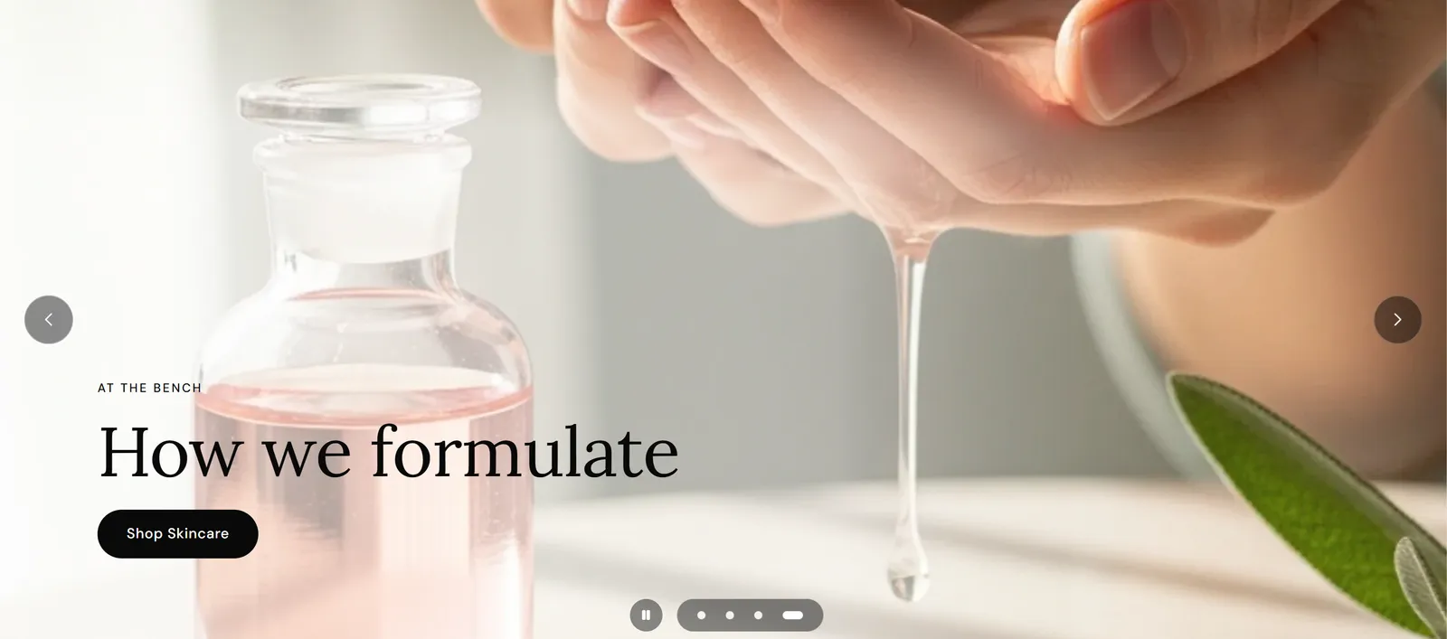
Carousel settings: Autoplay, Autoplay interval, Transition (Slide, Fade or Ken Burns (zoom)), Transition speed, Loop slides, Show arrows, Show pagination, Pagination style (Dots, Counter (01 / 05) or Progress bar), Pause on hover.
Layout settings: Section height (Aspect ratio, Small, Medium, Large, Full screen or Custom), Aspect ratio, Custom height, Mobile height.
Slide block:
- Media: Media type (Image, Video (uploaded), Video (YouTube / Vimeo) or None (color / text only)), Image, Mobile image, Uploaded video, Video URL, Video poster / facade image, Loop video, Play sound, Autoplay video on active slide.
- Content: Eyebrow, Heading, Text.
- Buttons: Button label, Button link, Open link in new tab, and a second button.
- Layout: Content position (nine positions), Text alignment, Text background (Box or Gradient behind text), Box background color, Box background opacity, Box background gradient, Slide duration override.
Text over photos needs contrast. Use Text background to keep text readable on any image. Autoplaying slides pause on hover and keyboard focus, and shoppers can pause them.
Image with text
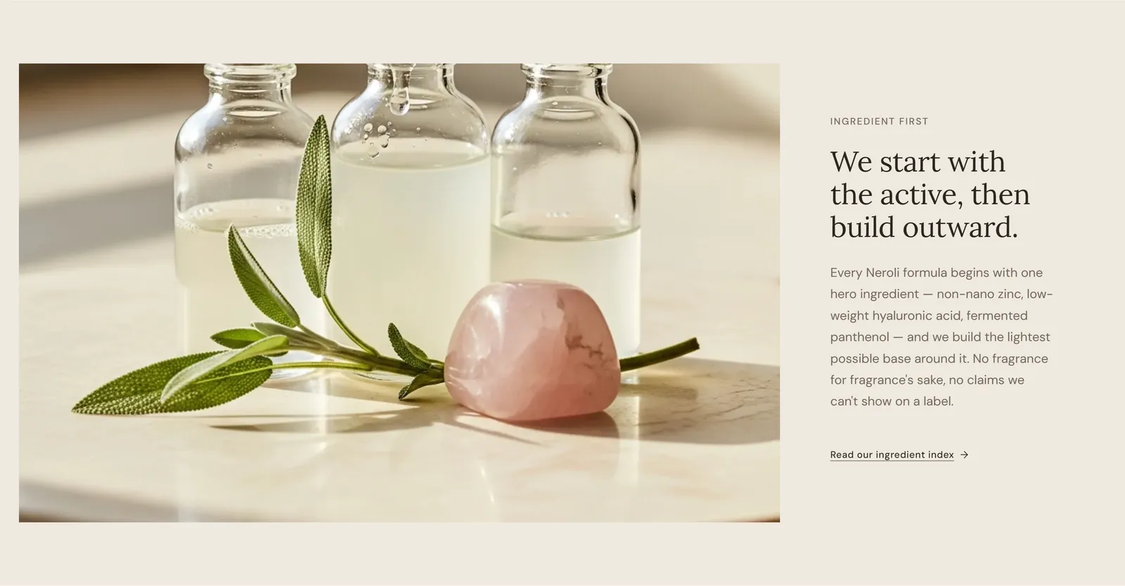
An image beside a heading, text and a button. Settings: Image, Image position (Left or Right), Image width (Equal, Wide or Wide content), Eyebrow, Heading, Text, Button label, Button link.
Rich text
A heading, text and a button. Settings: Eyebrow, Heading, Subheading, Content, Button label, Button link, Content width, Text alignment (Left, Center or Right).

Featured collection
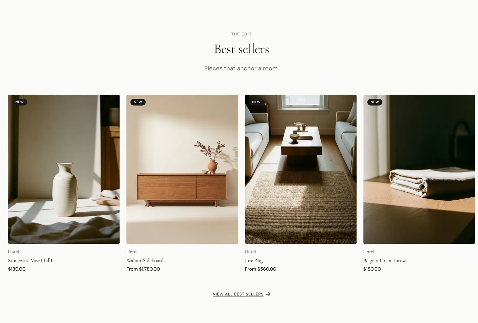
Shows products from one collection. Settings: Collection, Eyebrow, Heading, Subheading, Products to show, Desktop columns, Image ratio, Show vendor, Show secondary image on hover, Show quick add button, Show quick view button, Show star rating, Show color swatches, Show price, Show view all button, View all text, View all link URL.
Product list
A carousel or grid of products. Pick a Collection, or add Product blocks to choose products by hand.
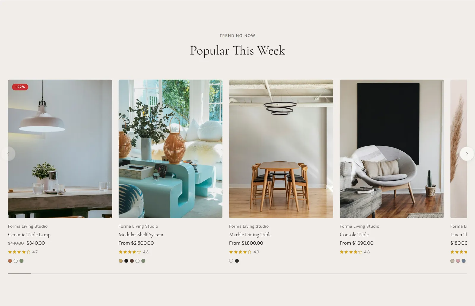
Settings: Layout (Carousel or Grid), Collection, Products to show, Eyebrow, Heading, Subheading, Columns on mobile, Columns on tablet, Columns on desktop, Card minimum width, Auto-fit columns on large screens, Image ratio, Show vendor, Show secondary image on hover, Show quick add button, Show quick view button, Show star rating.
Featured product
One product with its gallery, price and buy buttons, for use on any page.
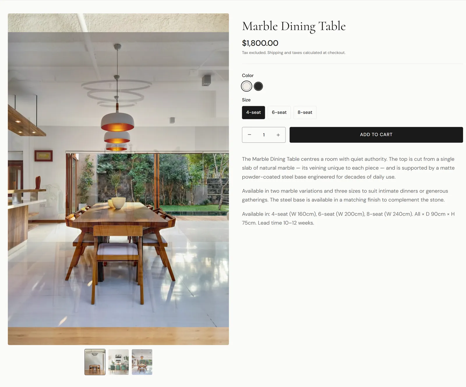
Settings: Product, Media position, Gallery style (Stacked, Thumbnails below or Carousel), Image aspect ratio, Image zoom (None or Open in lightbox), Show vendor, Show price, Show description, Show quantity selector, Show dynamic checkout buttons. Blocks: Custom Liquid.
Collection list
Shows collections as cards. Settings: Eyebrow, Heading, Subheading, Layout (Bento or Grid), Image ratio.
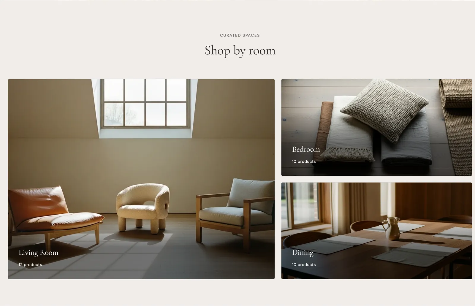
Blocks:
- Collection: Collection, Custom heading, Custom image.
- Promotion card: Heading, Text, Image, Link.
Editorial collage
A magazine-style collage. Settings: Eyebrow, Heading, Subheading, Layout (Asymmetric or Symmetric), Image ratio.
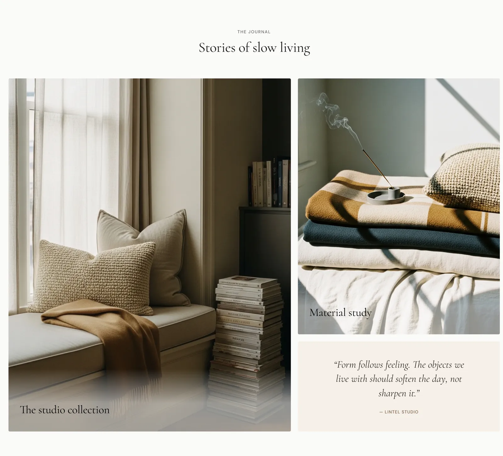
Blocks:
- Image tile: Image, Heading, Link, Size (Default or Large).
- Text tile: Heading, Text, Link text, Link URL.
- Quote tile: Quote, Attribution.
- Product tile: Product.
Shop the look
An image with clickable product dots. Settings: Eyebrow, Heading, Subheading, Image, Auto-adjust card position to avoid edges.
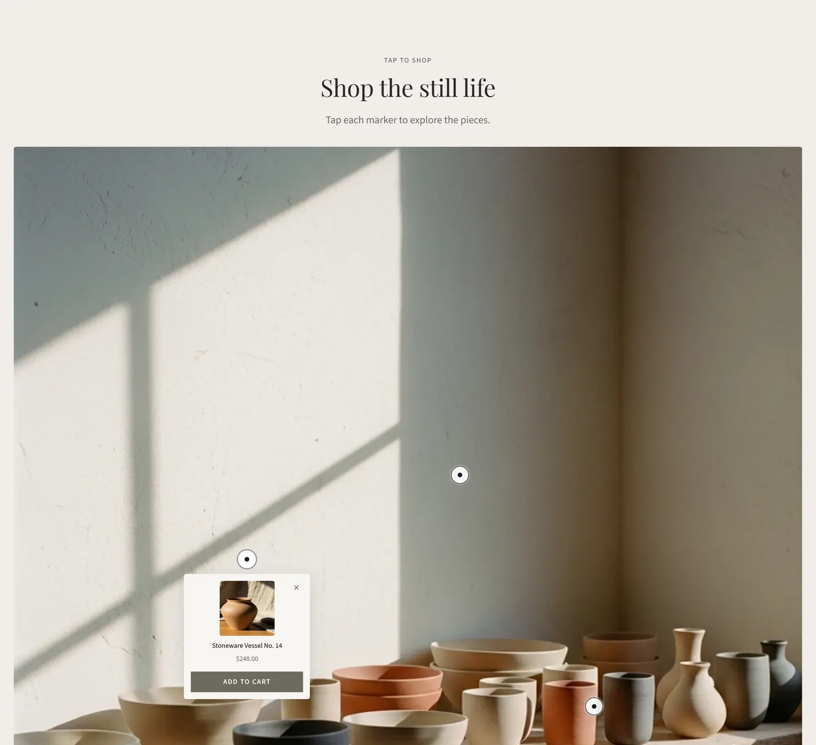
Hotspot block: Linked product, Product title (fallback), Product price (fallback), Horizontal position, Vertical position, Card position (Auto (smart placement), Bottom, Top, Left or Right), Show add to cart button.
Lookbook
A slideshow of looks, each with its own product hotspots. Available on the home page and on pages.
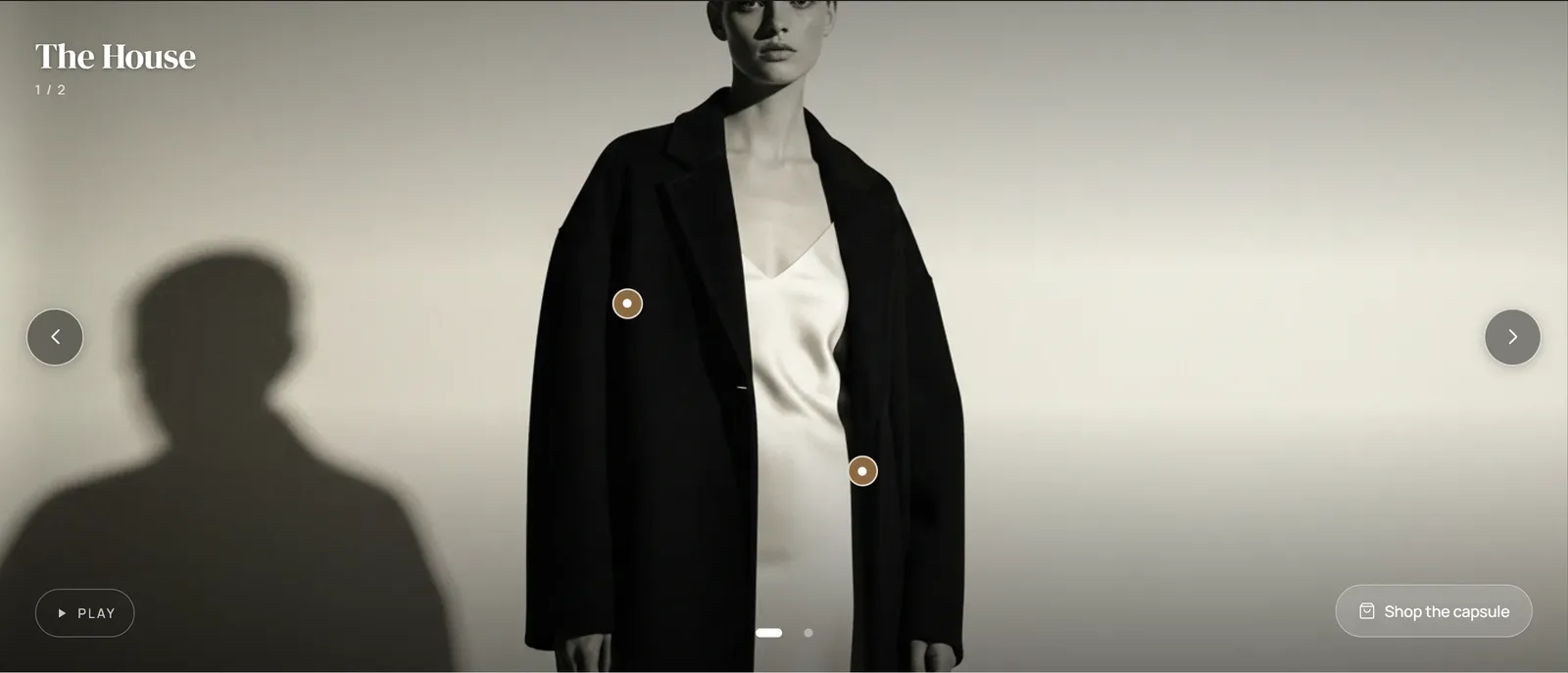
Settings: Auto-advance slides, Slide interval, Transition duration, Aspect ratio (21:9 (cinematic), 16:9 (widescreen), 4:3 (classic) or 1:1 (square)).
- Slide block: Image, Heading, Shop this look URL, Shop this look label.
- Product hotspot block (inside a slide): Product, Horizontal position, Vertical position.
Image gallery
A masonry or grid gallery of linked images. Settings: Eyebrow, Heading, Subheading, Layout (Masonry or Grid), Show footer link, Footer link text, Footer link URL.
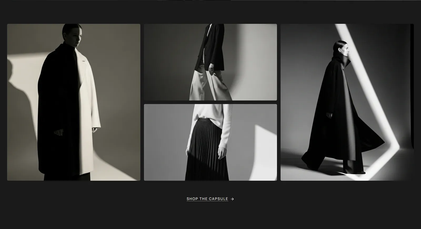
Room block: Image, Heading, Subheading, Link.
Customer photo gallery
A gallery of customer or social media photos with a follow button. Settings: Eyebrow, Heading, Subheading, Instagram URL, Instagram handle, Button text.
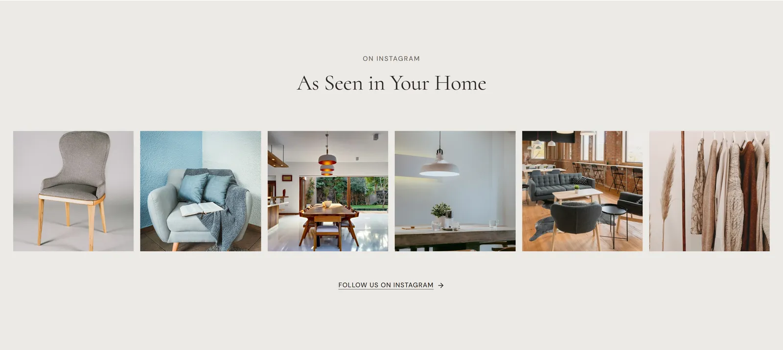
Image block: Image, Link, Alt text.
The images are ones you upload. The section doesn’t connect to an Instagram account.
Before / after
A draggable slider that compares two images. The slider works with a mouse, touch and the arrow keys.
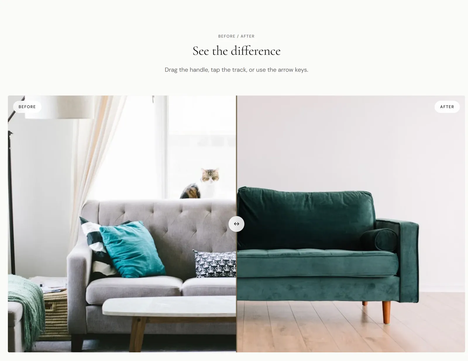
Settings: Eyebrow, Heading, Subheading, Before image, Before image alt text, After image, After image alt text, Show overlay labels, Before label, After label, Initial divider position, Enable intro sweep animation, Aspect ratio, Divider color, Width, Corner radius.
Comparison table
Compare products side by side.
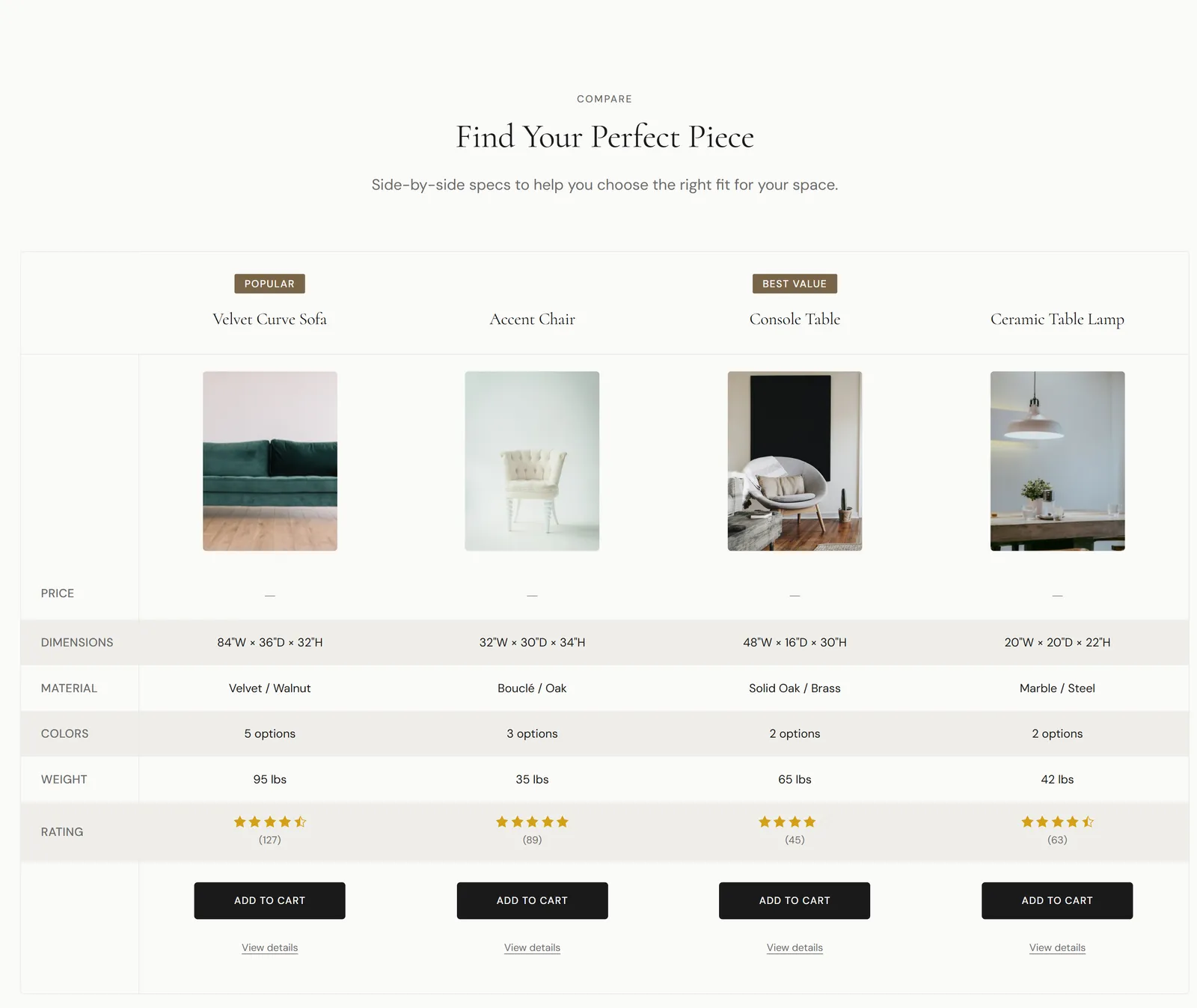
Settings: Eyebrow, Heading, Subheading, Show product images, Show add to cart actions, Width (Standard or Wide).
Blocks:
- Column: Linked product, Column heading, Badge text, Column image, Add to cart label, View details link.
- Feature row: Feature label, Feature description, Value type (Text, Price, Rating or Yes / No), Values. Enter one line per product, in the order the columns appear. For Yes / No rows, type yes or no. For Rating rows, type a number from 0 to 5, optionally followed by the review count in brackets, such as 4.5 (127). Type - to leave a cell empty.
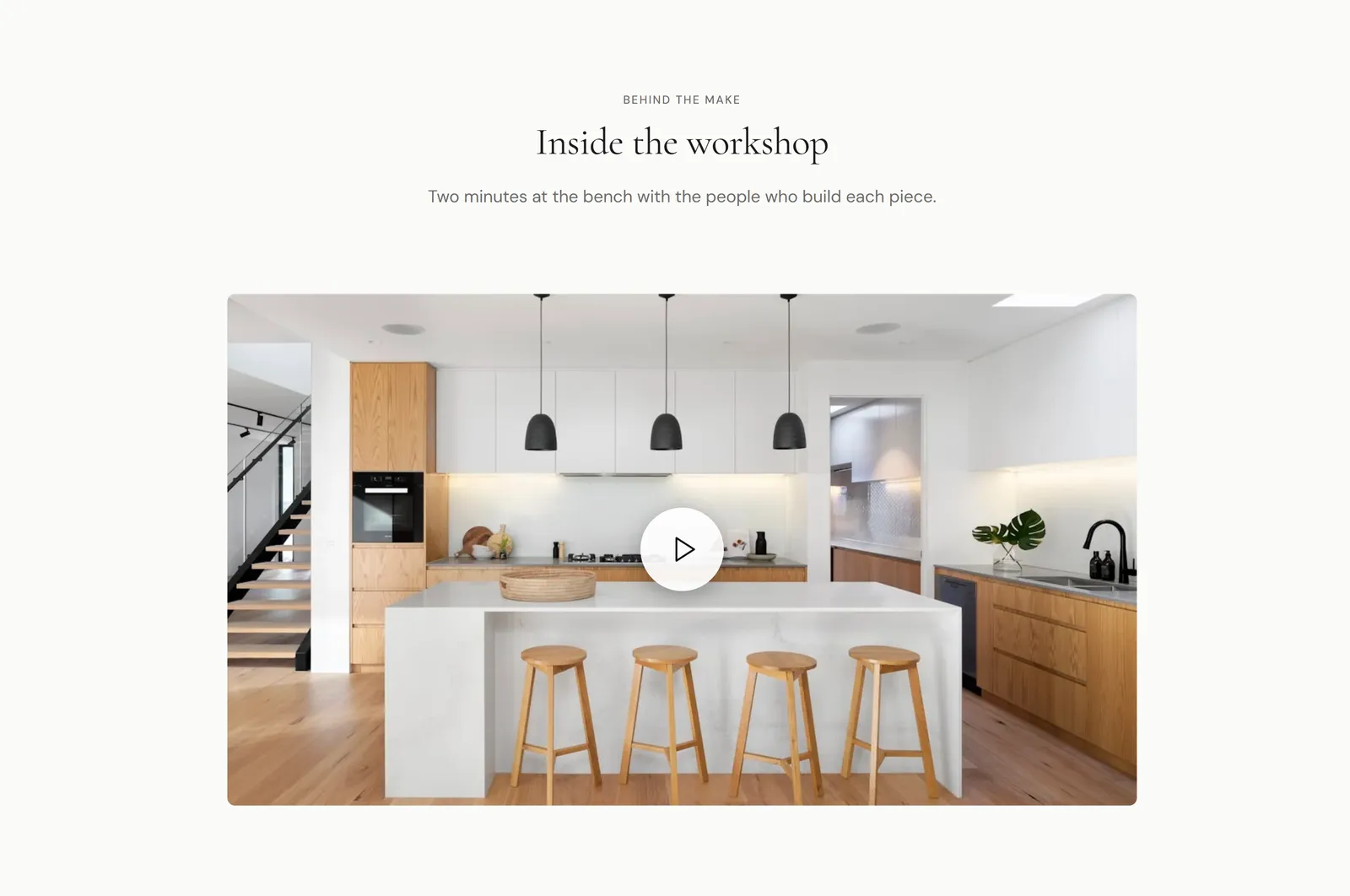
Video with modal
A poster image that opens a video in a dialog. Settings: Shopify-hosted video, Video URL (YouTube or Vimeo), Poster image, Poster aspect ratio, Autoplay when opened, Start muted, Eyebrow, Heading, Subheading, Text alignment, Video alignment.
Testimonials
Customer quotes. Settings: Eyebrow, Heading, Subheading, Show star rating, Show verified badge.
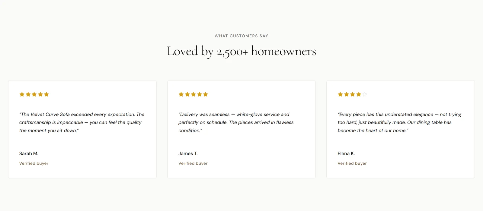
Testimonial block: Quote, Author name, Rating, Avatar.
Quote
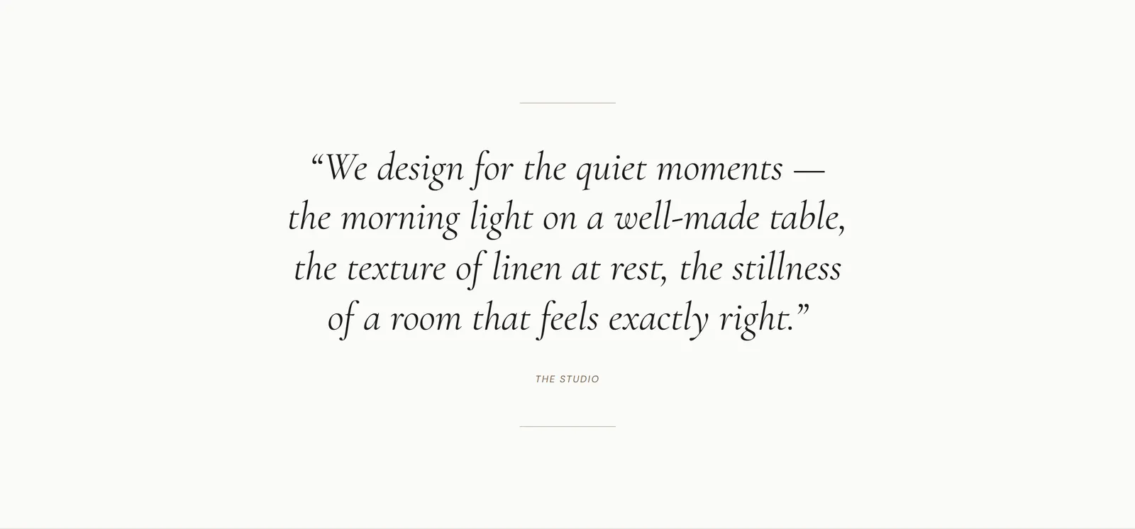
A short brand statement between dividers. Settings: Text, Attribution, Show top divider, Show bottom divider.
Logo list
Press, partner or brand logos. Settings: Eyebrow text, Heading, Description, Layout style (Grid or Marquee (auto-scroll)), Logos per row (desktop), Logos per row (mobile), Marquee speed, Pause on hover, Grayscale logos, Maximum logo height, Show top border, Show bottom border.
Logo block: Image, Name, Link.
Trust strip
A row of icons with short text, such as free shipping or easy returns. Settings: Show top border, Show bottom border.

Trust item block: Icon (None, Shipping, Star, Clock, Leaf, Shield, Heart or Custom), Custom icon image, Label, Description.
Newsletter
An email sign-up form. Sign-ups are added to your Shopify customers as email subscribers.
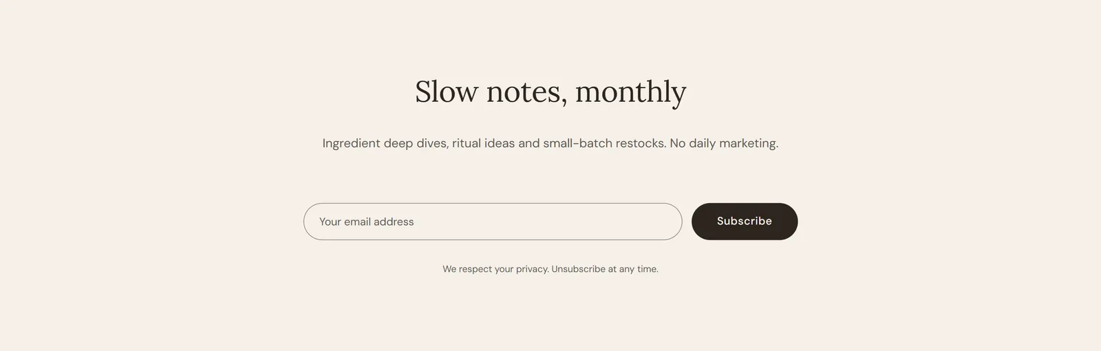
Settings: Eyebrow, Heading, Text, Button label, Social proof text, Disclaimer, Layout (Split or Centered).
FAQ accordion
Questions and answers, grouped by category, with an optional search filter.
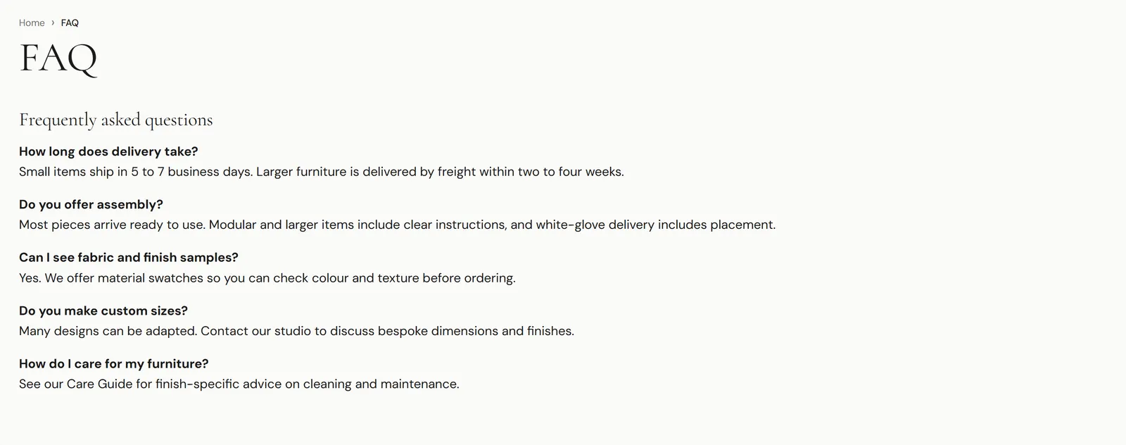
Settings: Show breadcrumb, Intro fallback, Heading, Intro text, Show search filter, Search input placeholder, Show “Still have questions?” call to action, Call to action heading, Call to action text, Button label, Button link.
Blocks:
- Category header: Heading.
- FAQ item: Question, Answer, Open by default.
Contact form
A contact form that sends messages to your store’s email address, with information cards beside it.
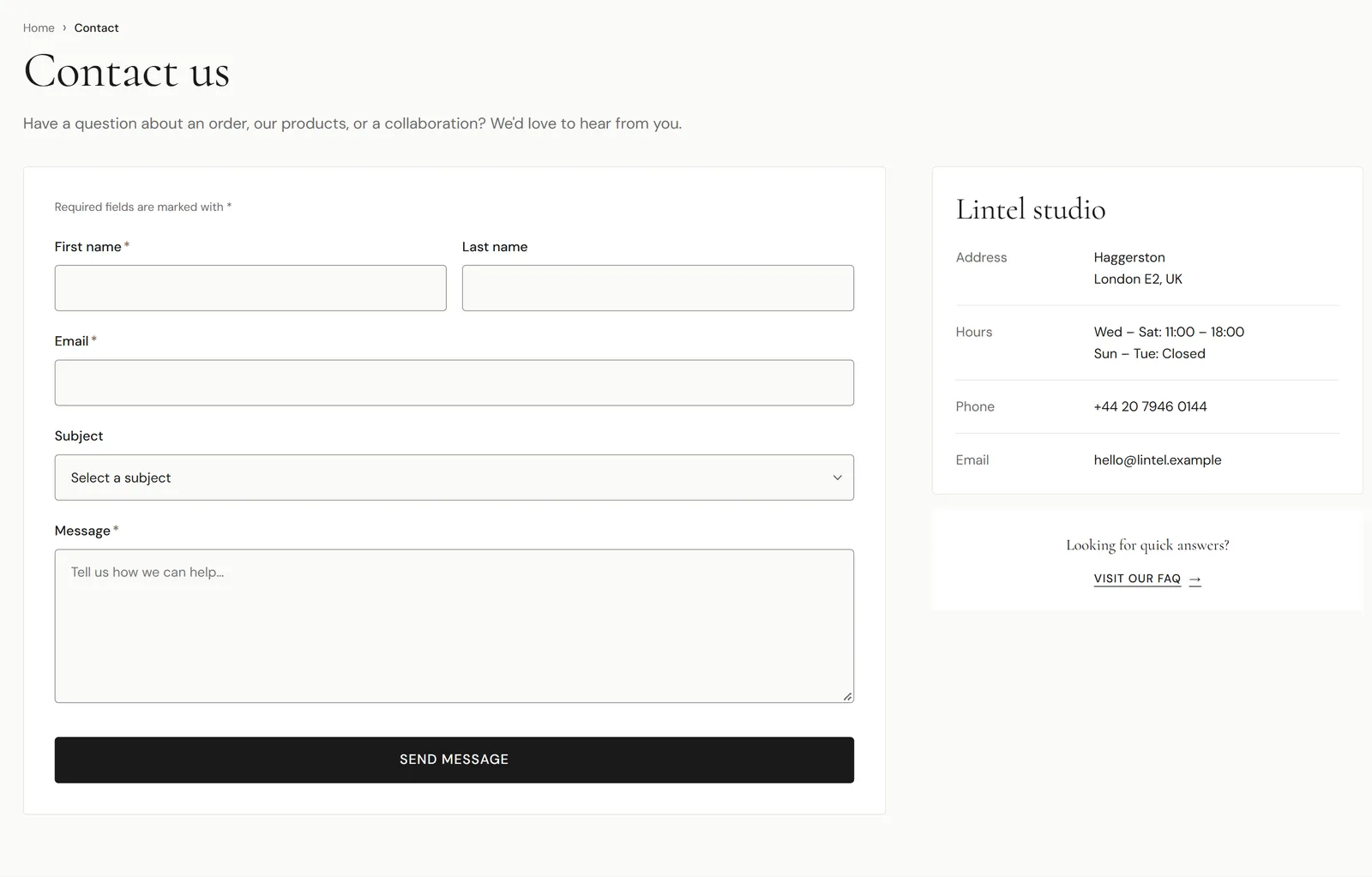
Settings: Show breadcrumb, Intro fallback, Heading, Intro text, Show phone field, Show subject field, Subject options (comma-separated).
Blocks:
- Information card: Icon, Heading, Body.
- Studio details: Heading and up to four label/value rows.
- Map: Map image.
- Quick answers call to action: Heading, Button label, Button URL.
Store locator
A searchable list of your stores with opening hours and a map.
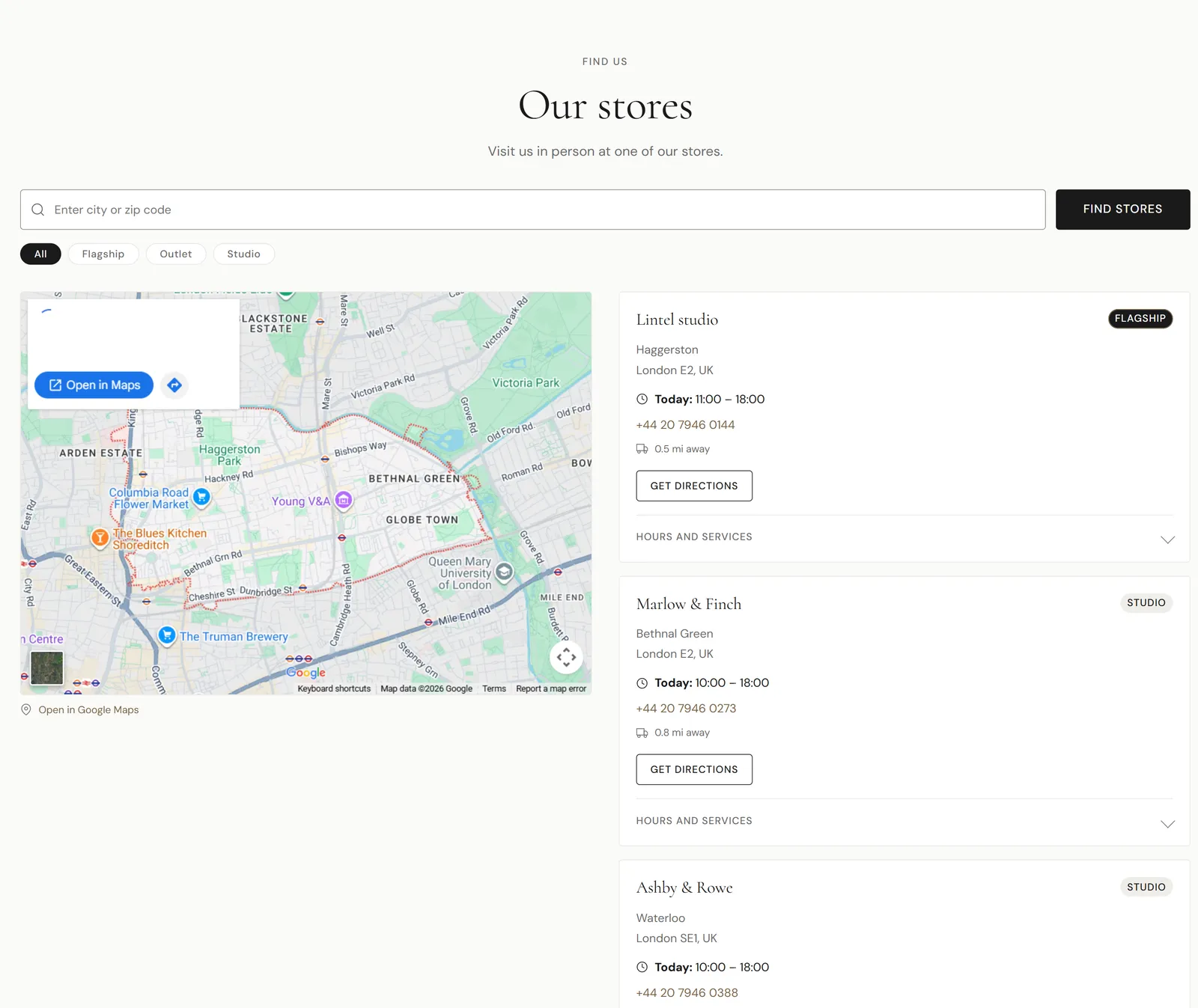
Settings: Eyebrow text, Heading, Description, Search input placeholder, Search button label, Show type filters, Show map column, Map address, Map zoom level, Map height (desktop), Map height (mobile), Static map image, Custom Google Maps embed URL.
Store block: Storefront image, Store name, Store type (Flagship, Outlet or Studio), Street address, City, state / postal code, Phone number, Distance, opening hours for each day, Services, Latitude, Longitude.
About hero
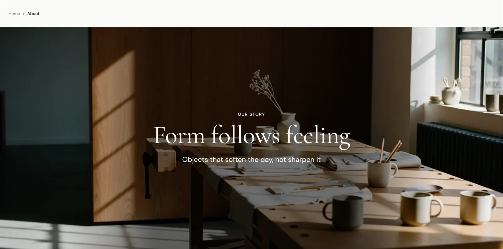
The top of an about page. Settings: Show breadcrumb, Breadcrumb color scheme, Eyebrow text, Heading, Subheading, Background image, Overlay opacity, Minimum height.
About story
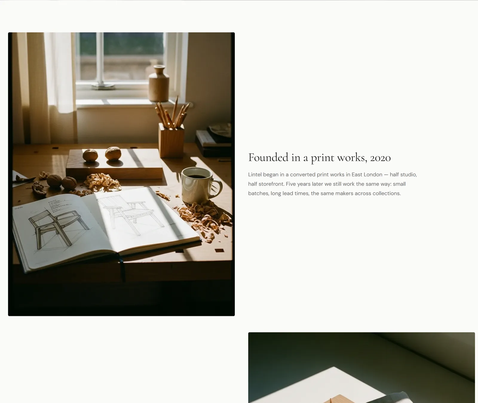
Alternating image-and-text rows. Settings: Image ratio. Story block: Image, Heading, Text, Image position.
About team
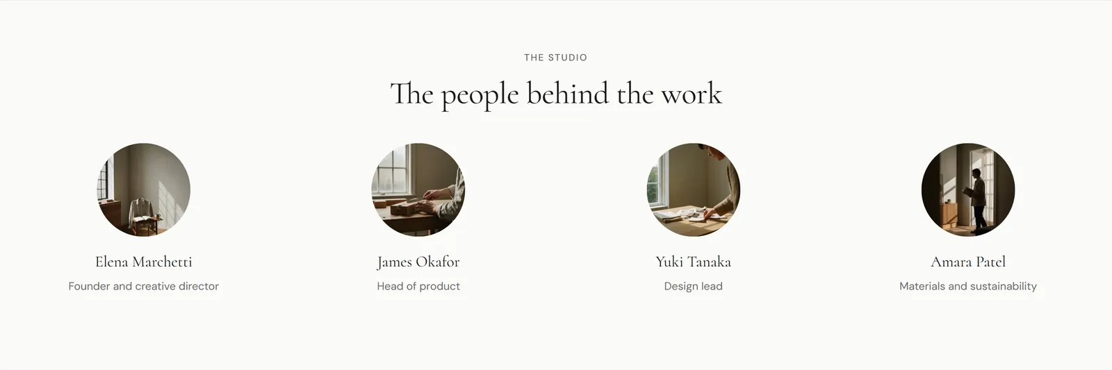
A grid of team members. Settings: Eyebrow text, Heading, Columns on desktop. Team member block: Photo, Name, Role, Bio.
About values
A grid of brand values. Settings: Eyebrow text, Heading, Columns on desktop. Value block: Icon image, Heading, Text.
Material story
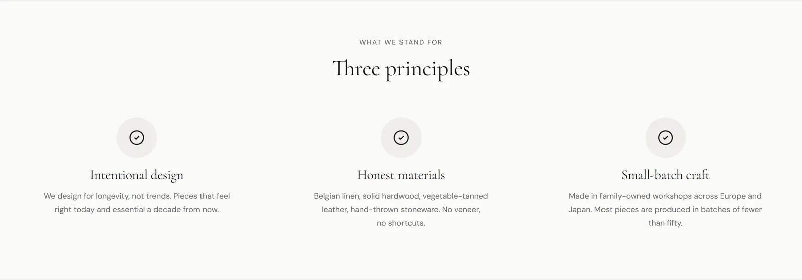
A long-form page about one material, available on page templates. It has a hero, an origin story, a stats grid, a process timeline, care instructions, featured products and related materials. Each part has its own Eyebrow and Heading settings, plus Featured collection, Products to show and Process band color scheme.
Blocks: Stat (Icon, Value, Label), Process step (Image, Step heading, Description), Care item (Question, Answer, Open by default), Related material (Image, Material name, Link).
Related articles
Articles related to the one being read. Settings: Heading, Number of articles, Use carousel on mobile, Source blog, Match by (Same tags, Same blog (most recent) or Manual selection), Show previous / next navigation, Image ratio, and options to show the image, tags, date, reading time, author, excerpt and “Read more” link.
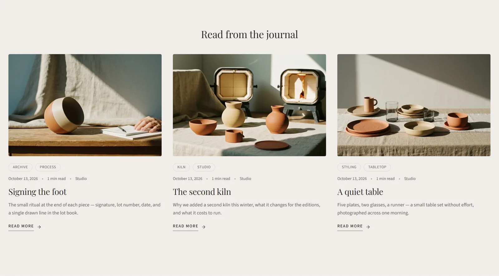
Article block (for Manual selection): Article.
Custom section
An empty section you fill with Group and Text blocks to build your own layout. Settings: Background image.
- Group block: Layout direction (Horizontal or Vertical), Alignment, Padding. Groups can contain other blocks.
- Text block: Text, Text style (Title, Subtitle or Normal), Alignment.
Custom Liquid
Adds your own Liquid, HTML or app code. See the Custom Liquid tutorial.
Template sections
These sections belong to a page type and can’t be added elsewhere.
| Section | Template | Main settings |
|---|---|---|
| Blog posts | Blog | Subheading, Show breadcrumb, Articles per page, Articles per row (desktop), Image ratio, Show featured article, Show tag filter, Show “Page X of Y” text. Blocks: Featured article, Tag filter, Intro text. |
| Article | Article | Show breadcrumb, Show hero image, Hero aspect ratio, Show meta bar, Show author avatar, Show reading time, Show tags, Show floating share sidebar, Show inline share row below content, Show author bio, Default author bio, Show comments, Comments per page, Limit text width, Content max width, Drop cap on first paragraph. |
| Page | Page | Show breadcrumb, Show intro, Intro text, Limit text width, Content max width. |
| List collections | Collections list | Heading, Subheading, Intro text, Columns on desktop, Columns on mobile, Card aspect ratio, Card text position, Show product count, Show collection description, Sort order, Collections per page. |
| Gift card | Product (gift card) | Hero text, card preview, recipient form labels, delivery options, trust badges and FAQ items for gift card products. |
| 404 | 404 page | Heading, Subtext, Illustration, Show ‘Back to home page’ button, Show search form, and Suggested link blocks. |
| Password page | Password | Show logo / shop name, Heading, Subheading, Background image, Overlay opacity, Show newsletter signup, Show password form, Show social media icons, Show “Are you the store owner?” link. |
| Customer account pages | Customer account templates | Login, register, account, order, addresses, activate account and reset password pages. A few options such as Show eyebrow and Show account statistics. |
The customer account templates are used only with classic customer accounts. If your store uses the newer customer accounts, Shopify hosts those pages and the theme's account sections aren't shown.